How to Read a Synoptic Chart: A Beginner's Guide to UK Weather Maps
Open a synoptic chart for the first time and it looks like someone dropped a plate of spaghetti on a map of the Atlantic. Stick with it for a few minutes, though, and the lines resolve into something remarkably readable: a snapshot of the pressure patterns steering Britain's weather. Synoptic charts are the working tool of every forecaster, and once you can read one you can judge for yourself whether that approaching band of rain will reach you before lunch or hold off until evening.
What the chart is actually showing
A synoptic chart is a map of the atmosphere at one moment, reduced to sea level. Air pressure falls with height, so forecasters adjust every reading to what it would be at sea level — that way a station on a Welsh hill can be compared fairly with one in Norfolk.
The numbers are in hectopascals (hPa), the same unit as the old millibars. Standard pressure is around 1013 hPa: anything much above that is high, anything much below is low. The curving lines joining places of equal pressure are isobars, usually drawn at 4 hPa intervals on UK charts — 1000, 1004, 1008 and so on. Alongside them you'll see fronts marking the boundaries between air masses.
Isobars: your first clue about wind
Wind is driven by pressure differences, so isobar spacing tells you almost everything about how windy it will be. Where isobars are bunched tightly, the pressure gradient is steep and the wind will be strong. Where they sprawl across half the chart, expect light airs — and perhaps a sea breeze on the coast.
Direction follows a simple rule in the Northern Hemisphere, known as Buys Ballot's law: stand with your back to the wind and low pressure sits on your left. Around a low, winds blow anticlockwise; around a high, clockwise. Over the sea, wind blows roughly along the isobars. Over land, friction slows it and turns it slightly towards the low, which is why coastal and inland forecasts often differ.
A quick check: find your location and ask how close together the nearest isobars are and which way they run. Two or three squeezed into a short distance means a breezy day; a single isobar wandering lazily past your postcode means a quiet one.
Highs, lows and what they mean for you
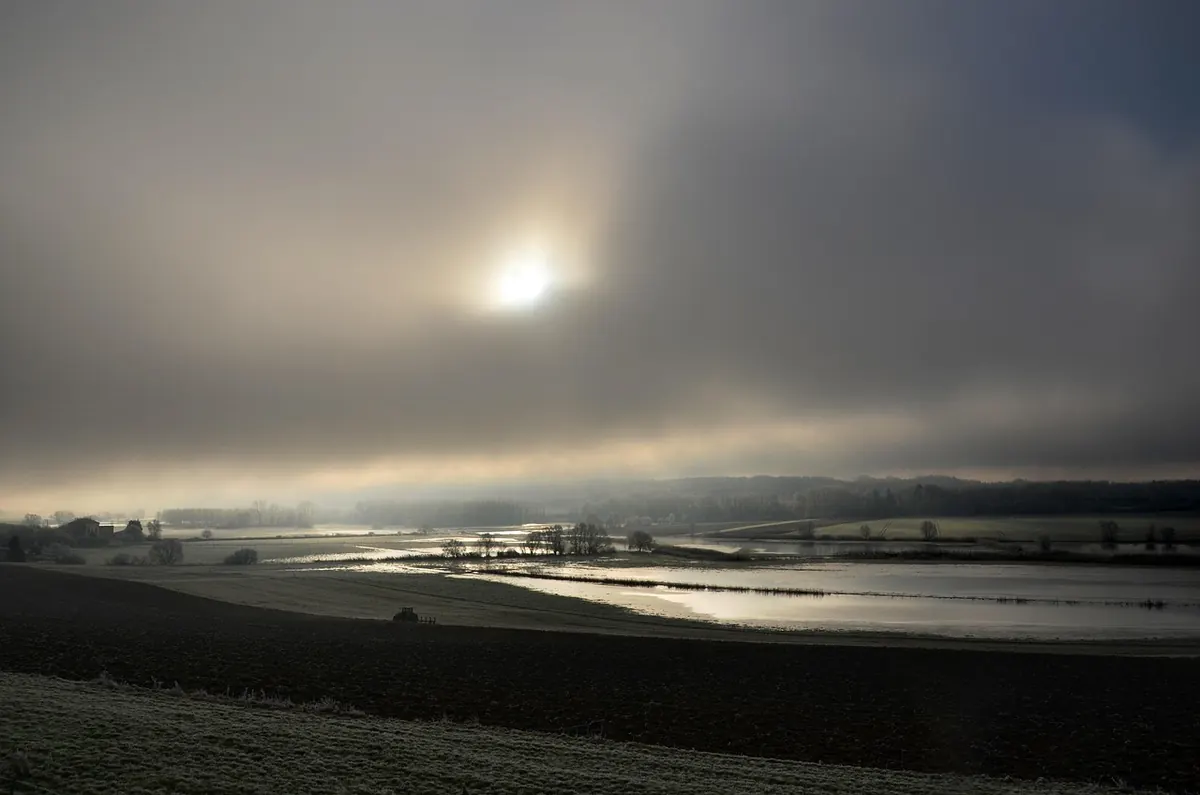
High pressure, marked with an H, is a region of sinking air. Descending air warms and dries, which suppresses cloud, so anticyclones bring settled weather — blue skies in summer, and in winter the classic recipe for frost, fog and stubborn grey murk that never lifts.
Low pressure is the opposite. Air converges at the surface and rises, cooling as it goes, so cloud builds and you get showers or longer spells of rain. The deeper the low — the lower its central pressure — the more energetic it tends to be.
You'll also meet ridges, elongated areas of high pressure, and troughs, narrow lines of low pressure where showers cluster. Neither is a full-blown high or low, but both shape your day.
Fronts: the battle lines between air masses
Fronts are where warm and cold air meet, and they're drawn with distinctive symbols along the line itself.
- Warm front — red line with semicircles. Warm air climbs gently over colder air ahead of it. Expect thickening cloud, then steady rain that can last for hours, and noticeably milder air behind it.
- Cold front — blue line with triangles. Cold air undercuts warm air and shoves it upwards fast, so rain tends to be heavier and shorter-lived, sometimes with squally winds, followed by a sharp drop in temperature.
- Occluded front — purple line with both symbols. A cold front has caught up with a warm front, lifting the warm air clear of the ground. These often bring the messiest, most persistent rain.
- Stationary front — alternating symbols on opposite sides. Little movement, so whatever rain it brings can sit over the same area for hours.
Watch which way the symbols point: they show the direction the front is travelling, usually west to east across the UK as Atlantic systems sweep in.
Reading a sequence: a low sweeping in from the Atlantic
Here's how a typical autumn or winter day unfolds when a low approaches from the south-west.
- Ahead of it, pressure falls. The sky turns milky, then overcast, with high cloud thickening.
- The warm front arrives. Rain starts light, becomes steadier, and the air feels raw.
- The warm sector passes overhead. Rain eases, the temperature nudges up, and it feels drizzly rather than properly wet.
- The cold front hits. Heavier rain, gusty winds, then a sudden drop in temperature as it clears.
- Behind the front, brighter skies return with scattered showers and a brisk, colder westerly. Pressure begins to rise.
Not every system follows this script — some lows stall, split or weaken — but recognising the pattern gives you a decent idea of what the next twelve hours hold.
Symbols and details beginners overlook
Two details are worth checking before you trust a chart. First, the time: synoptic charts are usually stamped in UTC, so a midday chart in July shows conditions an hour later than UK clock time. Second, whether it's an analysis or a forecast chart. An analysis shows what the atmosphere was doing at that moment; forecast charts, often labelled T+24 or T+48, are predictions and will shift between runs.
Look too for small arrows showing the expected movement of a system. When two forecast runs disagree about where a low will sit, treat the outlook as less certain — especially three or more days out.
Putting it to practical use
Start with a national chart, find the nearest low and high, then work out where you sit relative to them. Check isobar spacing for wind, trace any fronts approaching from the west and estimate when they'll arrive. Cross-reference with a local forecast and, ideally, live radar — the chart tells you the story, the radar tells you whether it's running to schedule.
Keep it simple at first. Read one chart a day for a fortnight and the patterns start to feel familiar: the ridge that brings a bright frosty morning, the trailing cold front that clears the air, the slow-moving low that parks itself for days. That familiarity is what turns a plate of spaghetti into a forecast you can genuinely use.
Photo: lucasgeorgewendt / Pixabay


You Might Also Like
From frosty January mornings to warm, thundery August afternoons, this month-by-month guide explains typical UK weather, regional quirks and how to plan ahead.
Warmer air holds more moisture, and UK rainfall is increasingly arriving in heavier bursts. Here is what the science says about storm rainfall, flood risk and attribution studies.